Viser innlegg med etiketten CMN sommerkonkurranse. Vis alle innlegg

lørdag 6. oktober 2012

Sommerkonkurranse, finale

Wow..I cant believe we`re at the finale now..and I`m still playing along in the CopicMarkerNorge-sommerkonkurranse:) I wanna thank you all for your nice comments, it means alot to me. I have to say that I was so happy when I saw my name at the list with the other finalist, and then I read the theme for the last round...totally open! First I panicked a little, and then it dawned on me, it`s the finale and I can do anything I want. I`ve had so much fun learning new techniques during this competition, but I`ve also been a bit stressed because I really wanted to play along. But now there is no more rounds, it`s at it`s end. So I felt truly content:) It doesnt matter anymore..so I could just relax and really have fun:)

And that`s what I`ve done..I`ve had fun:) Normally I can throw away my colorings because I`m not happy about it, but this time I didnt throw anything away, I just colored away, all in one go, and just enjoyed myself.

This is an idea that came to me earlier in this competition, it started out as a card, but it escalated somehow. This was the perfect moment to get started with it. It`s all thanks to this competition and the skills I`ve learned through the summer. I`ve used my blender, yellow, colored a background, masking and cutting out stamps, and the supercool airbrushing. I just love making my own patterned paper also. I`ve had heaps of fun this last round..so I want to thank you all so much at CMN for making this competition. And now for my project. I`m sorry but there will be lots of pictures and text:)

Here is my card, that grew into a carouselbook, my creative fairytale. It`s a gift for my two lovely girls:) The idea behind this book is to create our own fairytale based on the scene we`re looking at. The whole book will contain four scenes. I only had time to make two for this competition.


Frontpage. I think I`ve included most things girls like. Flower, pearls, glitter, butterflies, some swarovski bling, ribbons and all in bright cheery colors. The yellow backgroundpaper I made myself. I did the same as last round. First I embossed, this time with white UTEE, then airbrushed with two different yellows, used blender to remove color from embossing. At last I used some white dabber on the edges to soften them abit.  The text says "once upon a time" in norwegian, and it got some diamond stickles on. The pink circle is airbrushed with the circledie still on. The scallop behind + the butterflies also got airbrushed, but with three different colors, I really liked the result of that:)


The fairyscene. It doesnt show well on the picture but this is a 3d-scene with three layers. I`ll show more pictures of it later. Every girly fairytalebook needs a fairy. I`ve made it look as if you`re looking in on the fairy between some big old trees. The castle is colored quite dark, and also the clouds. Maybe it`s a happy fairy waiting for her fairyprince, or maybe there`s this evil witch in the castle. I`m looking forward to hearing what my girls say:)


Mermaids, every girl love them. My biggest girl came over to look when I was coloring(she`s just seen part of this, not the whole scene), and she was like: ooh this is so pretty, what colors are they gonna get? So I asked what she thought, and she said the seahorse should be pink. And so I made it pink:) All the shells and corals on the front layer got a thick layer of glossy accents, doesnt show that well in the picture.


Here you can see the book standing open. There is room for two more scenes and I already have some ideas for them. The front of the scene is 8" long x 5.5" high.


The back of the book is decorated with bright papers from Echo Park. I`ve made little pockets with tags in them. They are to be used to write down name of our characters, what the plot is and so on.


The tags, I made six, with three different designs. They are cut out with a Lifestyle Crafts die. I colored the stamps (Inkido-Stars+ Border, Stempelglede-Vintage Garden) with different copics, then sprayed blender on the tag, and stamped. The ribbon is also colored with copic.


The back of the book, I kept it quite simple. Paper from Echo Park. The letters are cut out with my cricut, and I colored them with copic in three different colors, and then I put lots of glossy accent on them to make them pop. The text says "the end" in norwegian.

And now if you like, even more pictures:) I took some before I put the scenes together. Every scene consist as said of three layers..here are the back and middlepart with some explanation to what I did.


Size: 5.5" x 11". This is two stamps, that after some editing, is merged together.


Size: 9" long. This is four stamps put together. This took some time cutting out! I used my scalpel to cut out every little thing on this scene. I added diamond stickles to her wings, and star dust stickles on her hands, and she`s blowing it on the mushrooms. They all got some white spots using copic opaque white. And if you look closely you can see I`ve used liquid pearls on the fairydress, hair and the flowers, buttercup and lavender lace.


Size: 5.5" x 11". I masked the castle and ship before I colored the background. The background is part airbrushed and part done by hand. I airbrushed some big blue streakes downwards, and some lighter blue. Then I went over by hand to make the streaks more pronounced. I used the blender to make bubbles in the water. The two red fish are lunar tails. I saw them when I was scubadiving in the red sea in Egypt. They were so lovely with their yellow fins and the rest all red. Couldnt resist putting them in:)


Size: 9" long. Also a lot of work cutting out with my scalpel. I just love the flowing hair of that mermaid. She`s also gotten some diamond stickles on her. The pearls in her shell I added after I took this picure. I`ve dotted some opaque white in the cheeks.
  

And at last..the cute little seahorse doing his dance for the mermaid:)

All the digistamps are from Make It Crafty. I`ve used open office and paint to merge and edit the stamps together. I also used my copic mulitliner to fill in some spots myself. It`s all printed on X-press it blending card. The size of the book is 5.5" x 5.5".

Name of stamps used:
Fairyscene: -enchanted castle -in the woods -big tree -fern log -forest flower -toadstool garden -Vixie
Mermaidscene: -coral border -shipwreck -mermaid castle -Siren of pearls -cute seahorse -underwater elements

These are the copics I`ve used:
Fairyscene:
Skin: E0000, 000, 00, 11, R20, BV00
Dress/hair: Y000, 11, 13, 21, 35 + blender.
Trees: E02, 25, 29, 30, 33, 35, 49, Black100, G20, YG61, 63, 67, 99
Rainbow: R35, 22, YR16, 12, Y35, 21, G24, 20, B24, 21, V28, 25, 22, V17, 15, 12
Sky: BG0000, 000 
Mushroom: R20, 22, 35, 37, 59
Grass: G40, 43, 46, 94, 99
Road: E41, 42, 43, 44
Flowers: B21, 24, 26, 37, V000, 09, 12, 15, 17
Castle: T1, 3, 6, 9, then I changed my mind and on top of that added: W0, 2, 4, 5, 7
Rock underneath castle: E70, 71, 74, 77, 79

Mermaidscene:
Skin: E0000, 000, 00, 11, 13, BV00, R20
Hair: E25, 33, 37, 50, 51, 53
Mermaid: RV29, YR0000, 00, 12, 14, 18
Castle: E25, 35, 50, 51, 53, 55, 57, 59, W2
Boat: E43, 44, 47, 49, T6, Black100
Sand: E40, 41, 42, 43, 44, 47
Ocean: B0000, 00, 02, BG000, 01, 02, 10, 13, 23, 70
Cute seahorse: RV13, 14, 29, 42, R00
Fish: R24, 39, 46, Y13 
Corals/algea/seaweed/shells: YG11, 13, 17, 61, 63, 67, 91, 93, 95, 97, 99, G20, 24, 28, 40, 46, BG34, BV00, RV13, 14, 42, R00, Y000, 11, 13, 35, 38, RV29, YR0000, 00, 12, 14, 18, E02, 30, 33, 35   

Tags: R46, 85, Y38, YG67
Letters on the back: YR16, RV13, Y35
Front of the book: R83, 85, YR00, 16, Y17, 13
Blender


I wish you all a very nice saturday evening. Big hugs to you all:)

mandag 17. september 2012

Sommerkonkurranse, del 5

I cant belive it`s part 5 of the CopicMarkerNorge competition! I think perhaps my sweet man must be tired about me fussing about this competition. It`s just a hobby right? I`ve had to tell myself several times now that this is just for fun, dont take it to serious:)

I really would like to thank CMN for this great competition. It's made me learn, and do, new techniques, and I like trying new things, just need a push:)

So this time we`re supposed to make a background for our motifs. At first I thought it should be some clouds or a mountain etc, but CMN clarified that it was not enough to mask together two stamps, we were to make our own background to mount our motif on. We had to use our imagination. I decided to make my own designpaper.

Then I figured I needed some new stuff, some of my markers were dry, and I really wanted an airbrush, so why wait?? :D I left an order late one evening at one of my favourite shops. The next day they sent it, so the day after it was in my mailbox. Superfast service!! Thank you Bikuben:)

So here are my background, I made three of them. You cant believe how much fun I had making them:)


The first one: I started with dotting the whole paper with RV95. Then I stamped with a Script stamp from Prima. I stamped with memento rich cocoa, I inked up the stamp and stamped three times before inking it up again. That way the script didnt get to dominating. At last I airbrushed the whole paper with RV95. I didnt want the airbrushing to be even, it`s supposed to look abit uneven. This is my first time with the airbrushing, so the uneven part was really easy *laughing*:)
I inked the edges with vintage photo before I adhered it to a brown bazzill.


The second one: I really liked the outcome of this one. With a stamp from Stempelglede Vintage Garden, I stamped the edges with Versamark. Then I embossed it with UTEE clear. I airbrushed it with RV99. This time I wanted it a bit darker on the edges. Then I used some blender on a q-tips, and very carefully removed the ink from the raised embossed areas. I had to be careful not to destroy the airbrushing inbetween the embossing. I used some time on that one!


The third and last one: I colored up an embossingfolder from Spellbinders. I used Y35, YG63 and RV95. I picked the colors from the motif I`d colored. Then I took a pice of X-press it blending card, used a mini-mister to spray it with blender, and ran it through the grand calibur. That way the color got transferred to the paper. The whites was a bit to white I thought, so I airbrushed a thin layer of RV91 on top of it.

Then I needed to make the rest of the card. I`ve got to say, I really had some trouble with this one. The RV`s wouldnt play nice! I usually like to color my motifs with very dark and light colors, getting a high contrast. But this time the RV99 wouldnt play nice..(when does it ever?)...so I went for a more soft look, achieving some contrast by using RV0000 as my lightest color, and RV95 as my darkest color.


The sweet girl is Crystal from Make It Crafty, she is printed on x-press it blending card. My backgroundpapers are also made from x-press it.

I tried something new when I colored the skin this time. I first put on a layer of BV00 for the shadows, then I layered the rest of the colors. It gave the skin another tint than what I normally get. Usually I go over with BV00 at the end. The result got a  bit more muted this way I would say.

The roses are also colored with copics, they were originally white roses from WOC. The cheesecloth is also from WOC. The twine is from Hero Arts. I`ve used a corner dies from Whimsy. The tag is from a friend. Both the tag and corners are colored with RV91.

These are the copics I`ve used:
skin: BV00, R20, E11, 00, 000, 0000
hair: E40, 42, 44, 47
dress/shoes: RV0000, 000, 91, 93, 95
shadow: N0, 2, 3, 5
rose: YG61, 63, 67, Y000, 21, 35

I wish you all a very nice week. Hugs:)

tirsdag 4. september 2012

Sommerkonkurranse, del 4

Tenk vi er kommet til del 4 i CopicMarkerNorge sin sommerkonkurranse! Dette er grusomt spennende altså, og det virker som om jeg ikke er den eneste som er litt gira over dette:)

Denne gangen var oppgaven maskering, og det er noe jeg egentlig aldri gjør! Så det ble en skikkelig utfordring for meg. Jeg har ikke så mange gummistempel som passer sammen til sånt, så det måtte bli digistempel. Det måtte også bli MakeItCrafty, jeg bare elsker de motivene.
Jeg plukket ut noen digistempel som jeg ville sette sammen, og fant fort ut at dette kunne ikke gjøres til et vanlig flatt kort, det måtte bli et staffeli med en liten add on.

Det blir mange bilder nå altså!


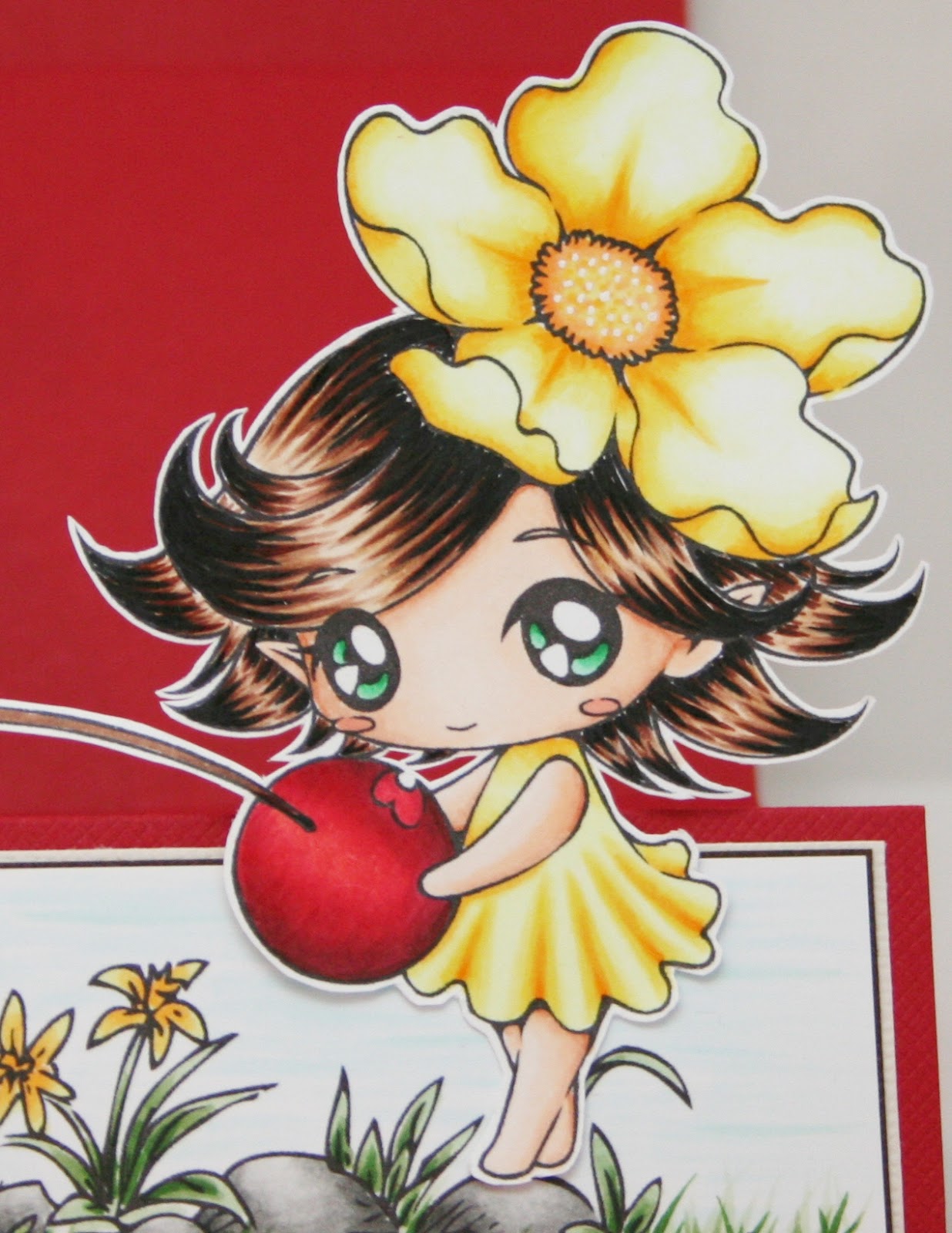
Jeg starter med et bilde av hele kortet. Målet var å lage et kort som var litt eventyrlig eller magisk hvis du vil. Jeg har lagd en scene med "rainbow dandelion" og "mushroom house".  Innbyggerne i min lille scene er "Pipi petal sprite" og "Cici". De igjen står på "pepplestone patch". Totalt ble det brukt 5 digistempel.


Her er kortet mitt lagt flatt. Det eneste som røper innsiden er at håret til Pipi stikker ut på siden.
Dandelion blomstene som hører til under regnbuen stod nede i høyre hjørne, og de ble nesten helt dekt av sopphuset. De delene som var igjen virket litt rotete plassert så jeg redigerte de bort.

Når det gjelder fargevalg så fargela jeg trærne, som skal være laaangt der bak, i mørke farger. Brukte YG90-serien. Sopphuset ble malt med brun og rødfarger i 30-serien. Regnbuen er farget med de lyseste fargene jeg har. Det hele var et forsøk på å lage en illusjon av at trærne er langt bak, huset fremst, med en lysende regnbue over.


Når du ser på en ekte regnbue så ser den gjennomsiktig ut. Så når jeg begynte å fargelegge regnbuen på scenen min så jeg at det ble feil! Alle de svarte strekene ødela inntrykket av en skinnende regnbue. Løsningen ble å printe ut motivet en gang til, men denne gangen med 70% gjennomsiktighet. På den måten fikk jeg helt svake linjer som passet meg bedre. I tillegg måtte jeg ha på litt glitter. Diamond stickles som jeg strøk utover med en finger for å få et helt tynt lag.

Jeg ønsket også å få litt mer dybde i motivet. Så både regnbuen og skyen er klipt ut og montert på limputer. Skyen ble limt på regnbuen med 2mm limputer, og på regnbuen brukte jeg puter i ulik tykkelse. Den ble limt flatt fast nede i motivet til venstre, og på vei oppover står den til slutt 4mm ut, og til slutt mot høyre hjørne er den nesten helt inntil motivet igjen.


Jeg brettet opp fronten på kortet når jeg tok bildet av jentene, slik at de skulle komme godt fram på bildet. Pipi petal sprite heter denne søte jenta. Jeg bare digger det lange håret! Fargene til kjole og blomst er hentet fra regnbuen. Tanken var at de skulle lyse opp helt fremst:)


Dette er Cici. Hun måtte få en annen hårfarge av meg, og jeg håper dere liker den. Jeg skulle egentlig bruke samme farge som hos Pipi, men midtveis gikk E49 tørr!! Den er for tiden en av favorittene mine når jeg farger hår og jeg ble litt satt ut. Hun skulle ha mørkt hår så jeg måtte bruke 100black! Igjen har jeg hentet farge fra regnbuen når kjole og blomst skulle fargeleggges.


Teksten er av Lillebjørn Nilsen og jeg syntes den passet så godt inn her.

Kortet er ellers minimalt pyntet, hele fokuset er på scenen og de to jentene. Det eneste jeg har brukt er et bånd og en liten blomst jeg har klippet ut. Blomsten er den samme som i håret til Cici.

Så var det listen med copics jeg har brukt, og den ble lang!

Himmel/          BG0000, 000, 10, 13, 70
skyer/             W0, 2, 4, 5, 7
sol:                 Y11, 13, 35, 38, YR24

Sopphus:         R20, 22, 35, 37, 39, 59
                      E30, 33, 35, 37, 29
                      T0, 1, 3, 4, 6

Regnbue:        R0000, 00, 02, 05
                      G0000, 00, 02, 05
                      Y000, 11, 13, 17
                      B0000, 00, 02, 04
                      YR0000, 00, 02, 04

Skog/              YG91, 93, 95, 97, 99
planter:           YG11, 61, 63, 67, G29 

Hud:                E0000, 000, 00, 11
Hår:                 Pipi: E50, 53, 57, 49 / Cici: E25, 29, 30, 53, 100black
Kjole/               Pipi: G0000, 00, 02, 05, G17
blomst:            B0000, 00, 02, 04           
                       Cici: Y000, 11, 13, 17, 38
                       YR00, 02            

Takk for besøket:)

mandag 20. august 2012

Sommerkonkurranse, del 3

Da var det på tide å legge ut mitt bidrag til tredje runde i CMN sin sommerkonkurranse.
Denne gangen har jeg lagd en gavepose. Det blir litt flere bilder enn vanlig :)


Motivet er fra Make It Crafty, mermaid Shellina, og er fargelagt med copics.


Selve fronten på posen. En salig blanding av bølgepapp med blå perfect pearl mist, osteklut, blomster, halvperler, diecuts, seambinding og twine. Absolutt ikke noe less is more her altså!


Et bilde av tagen som er plassert bak bølgepappen. Seambindingen er fargelagt med copics og blender, og i stæsjet mitt fant jeg en havfruecharm som bare måtte være med. Kantstempelet er fra Stempelglede.


Baksiden av posen ble helt enkelt pyntet, og jeg har brukt stempel fra Kort og Godt. Det er også limt paneler på sidene av posen.


Jeg avslutter med et nærbilde av Shellina, og en liten forklaring på hva blenderen min har gjort.
Sjøhesten min har fått prikkesyken :D Jeg ønsket å gi han en "skjellete" struktur, så jeg brukte tuppen på blenderen mot motivet for å lage små lyse flekker. Jeg gjentok prosessen flere ganger til jeg ble fornøyd. Jeg prøvde det samme med havfruen, men det vises ikke like godt der. Litt vanskeligere å lage lyse flekker i en mørk RV-farge.

Neste trinn var bakgrunnen rundt motivet. Jeg brukte blenderen for å lage lyse streker ut fra motivet, formålet var å lage en følelse av bevegelse i vannet.

Copics brukt:
Hud: E0000, 000, 00, 11, 13
Hav: BG0000, 000, 70, B0000, 91
Havfrue: RV0000, 91, 93, 95, 99
Hår: E50, 53, 57, 49
Sjøhest: YG61, 91, 93, 95, 99, E74

Boblene i vannet har jeg tegnet inn med copic multiliner.

Håper du likte posen min.
Ha en riktig god kveld :)

fredag 20. juli 2012

Sommerkonkurranse, del 2

Jippi jeg gikk videre i CopicMarkerNorge sin store sommerkonkurranse :)
Oppgaven for neste runde var en skisse, og fargen gul.

Jeg har holdt på i mange dager med kortet. Jeg har vridd og vendt på ting men har ikke blitt fornøyd! En del av hjelpen kom uventet i postkassen min. Jeg hadde bestilt noen magnetplater, og med i pakken kom noen diecuts. En av de passet perfekt inn i grunn, rett farge og størrelse. Det er den røde hjerteborden fra Cheery Lynn jeg snakker om. Tusen takk til kreativ scrapping :)

Her kommer mitt bidrag til runde 2.
Motivet er av Elisabeth Bell, og er selvfølgelig fargelagt med copics.


Mønsterark er fra Basic Grey, doilyen er en dies fra Cheery Lynn.
Gul divine bakers twine fra WOC, og en liten tag fra Elin..tusen takk til deg:)


Innsiden er pyntet for å matche forsiden. Stemplene er fra Kort og Godt.

Copics jeg har brukt:
E0000, 000, 00, 02, 11, 25, 29, 30, 31, 33, 35, 37, 49
B0000, 00, 02
BV00
R20, 22, 46, 59, 81, 83, 85
RV0000, 00, 99
Y000, 35, 38
YR20, 21, 24
G40, 43, 46
YG95, 99
Blender
Ja jeg vet..det ble fryktelig mange :D

onsdag 4. juli 2012

Sommerkonkurranse, del 1

Første runde i CopicMarkerNorge sin sommerkonkurranse er i gang, og jeg rakk akkurat hjem for å lage første bidrag før jeg reiser bort igjen!


Motivet er et digistempel fra Make It Crafty, Elven Ardella.
Det er printet på X-press it blending card, og selvfølgelig fargelagt med copics. 

Fargene jeg har brukt er:
Hud/ansikt: E0000, 000, 00, 02, 11, R00, BV00
Klær/vinger: RV000, 91, 93, 95, 99
Hår: E40, 42, 44, 47, 49 

En riktig GOD SOMMER til dere alle :)